Overview
People are seeing how their actions affect the planet and the way they live. They are interested in becoming more sustainable and look at Eco-brands and social media for help.
The Challenge
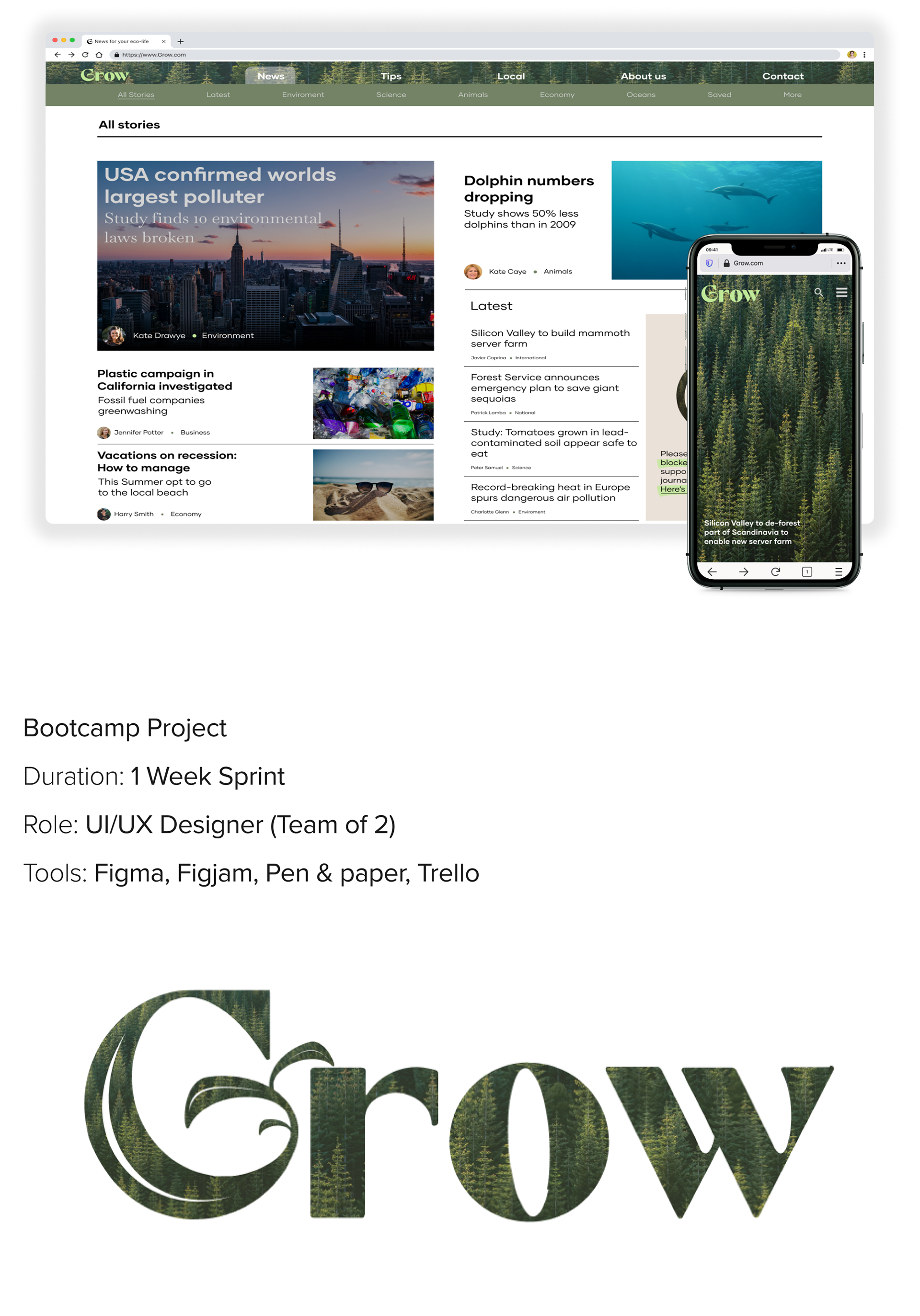
The scope of this project is more UI-focused. Create an editorial platform for a user interested in a more sustainable lifestyle. The design should have at least 3 different page layouts.
Solution
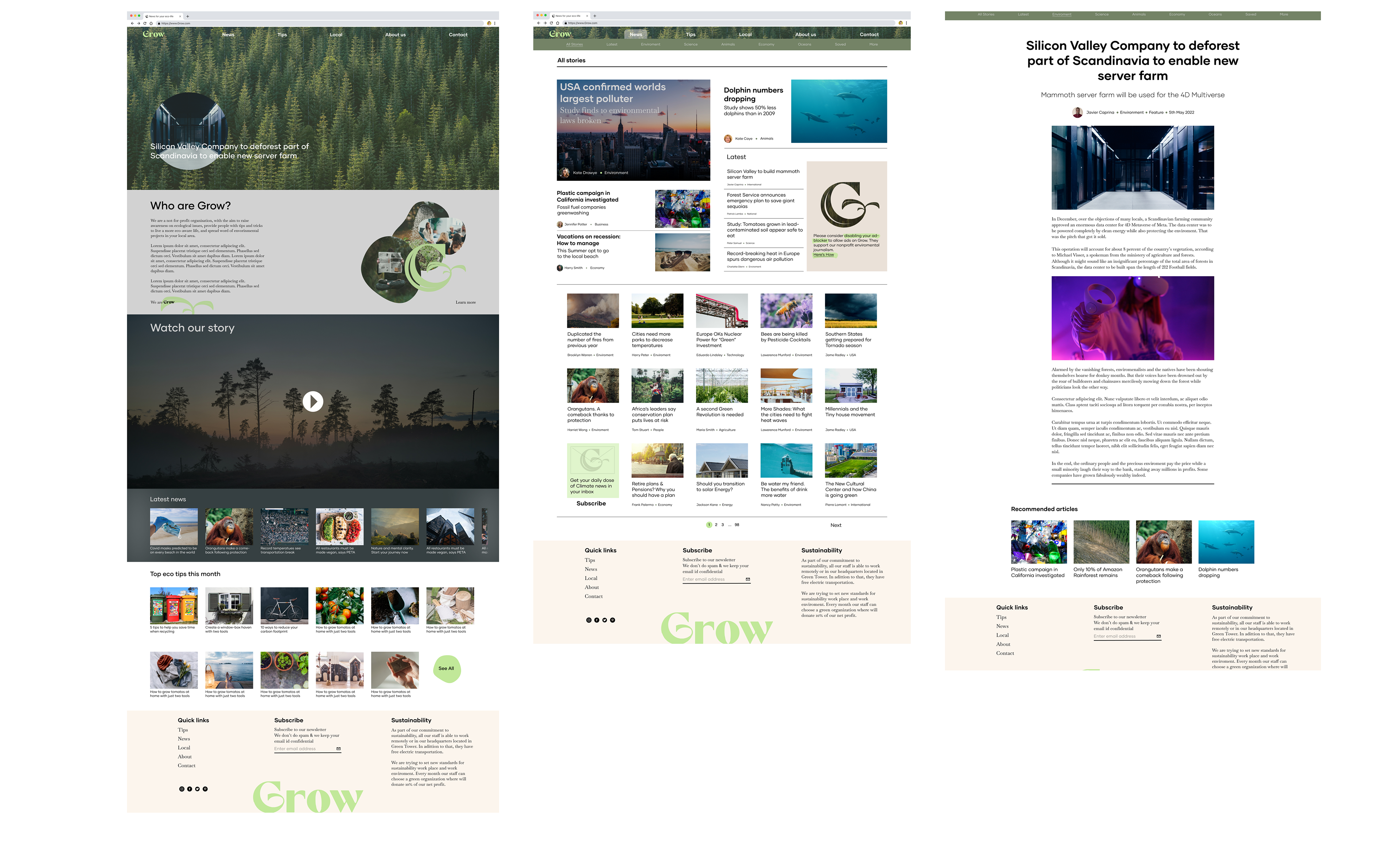
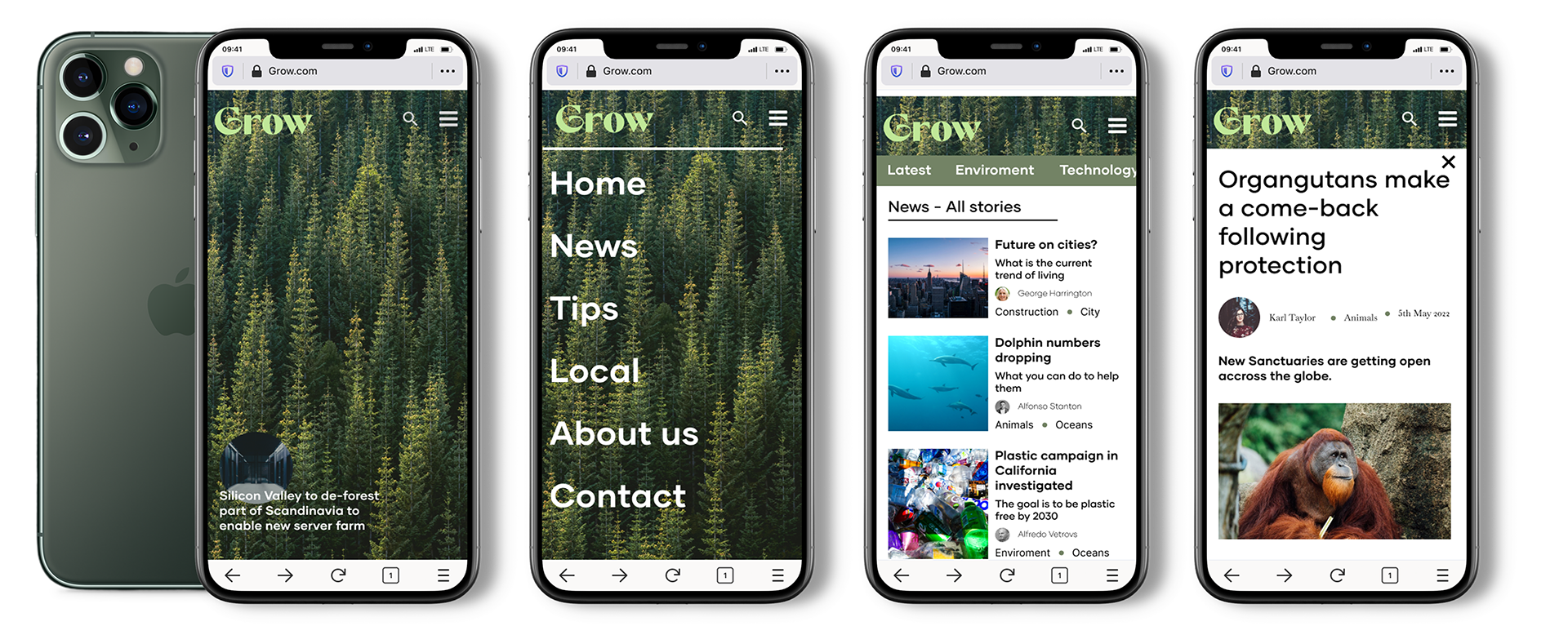
● Editorial brand website on mobile and desktop for people living in Portugal.
● A user flow where an international article and a local article are read.
● A Homepage with sections for news, tips and tricks, information about the brand, and the option to subscribe to a newsletter.
Research —
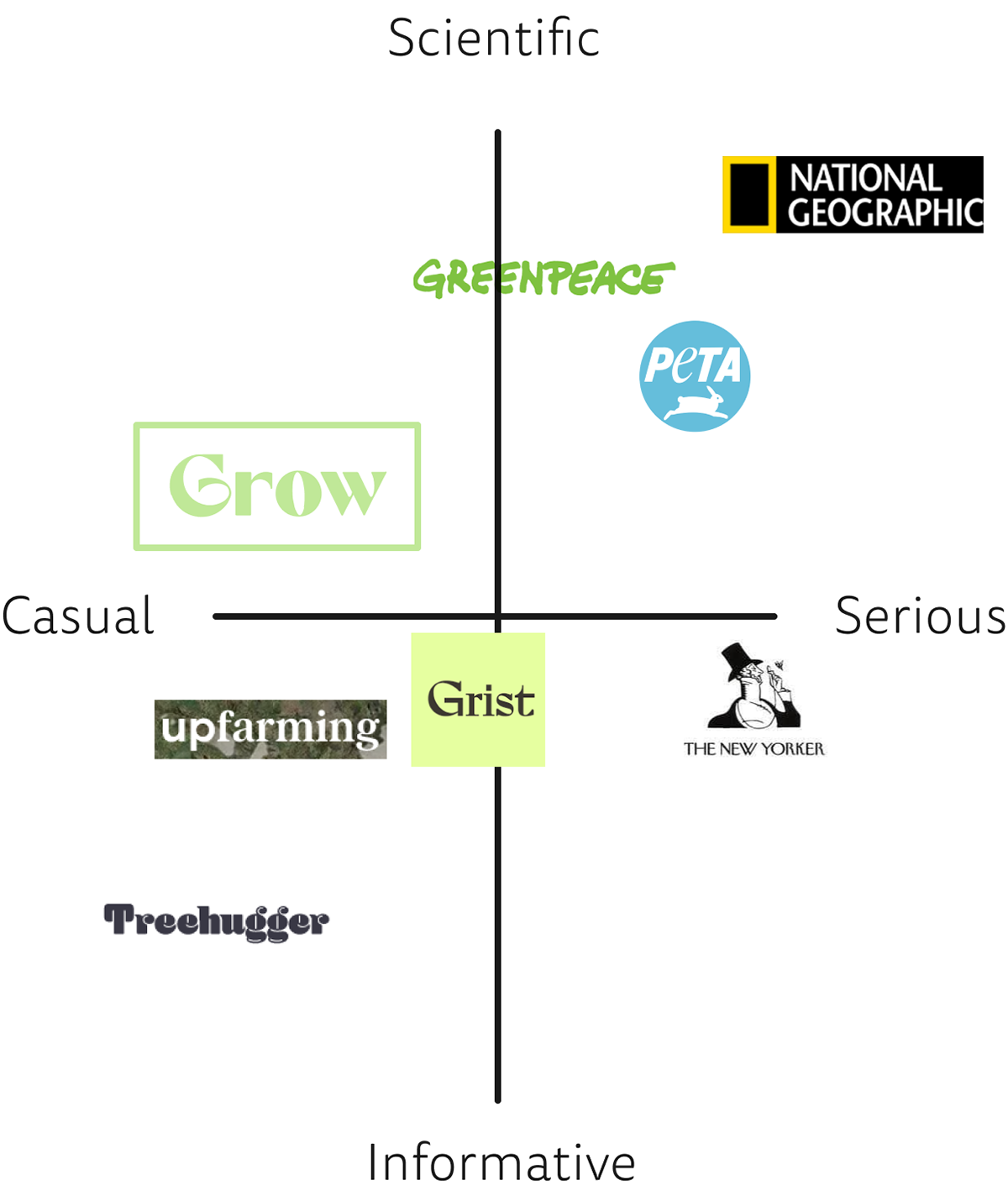
In order to understand the user and define the project. My partner researched current platforms like National Geographic and Greenpeace.
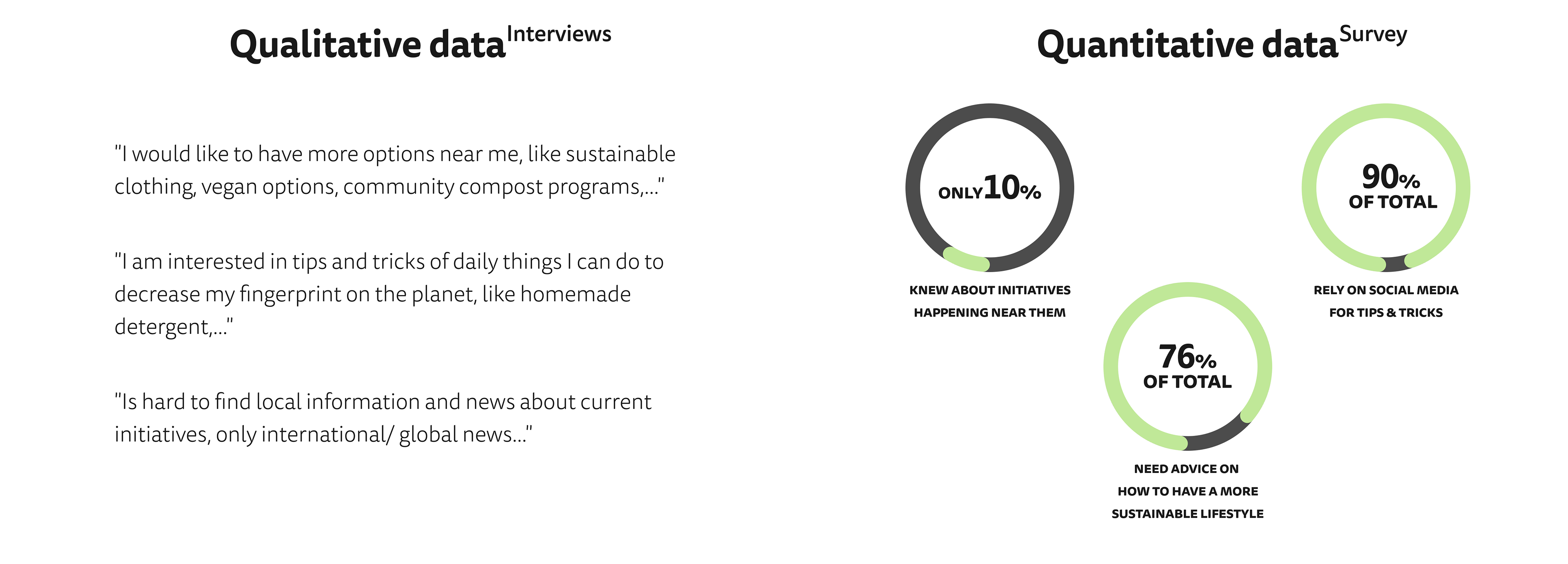
I conducted 4 Guerrilla interviews with the goal to gather information about the topic from the user perspective and what tools they used to get informed. And interviewed 5 more people to understand their pains, and concerns, and learn about what they wanted to see in an online newspaper about sustainability.
I conducted 4 Guerrilla interviews with the goal to gather information about the topic from the user perspective and what tools they used to get informed. And interviewed 5 more people to understand their pains, and concerns, and learn about what they wanted to see in an online newspaper about sustainability.
Define —
How Might We give the eco-user, information about international and local news as well as advice on how to be more sustainable?
Based on the statement above we created our persona and outlined sections and features of the website.
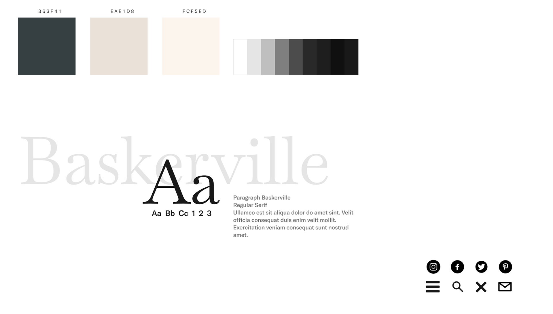
Branding —
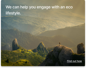
Grow is the go-to place to read about ecological matters happening near you and learn from sustainable practices.
Our goal was to create an informational news platform where users can not only read about international matters but also about things happening in their area. A place where advice and tricks are fact-checked and explained by professionals. So users can become more sustainable.

Testing & Iterations —
Through testing the low-fidelity, mid-fidelity, and hi-fidelity we were able to make changes in each iteration based on the user feedback.
Some of the biggest changes occurred testing our mid-fidelity wireframe.
But overall this phase characterized by reducing and simplifying sections.
—
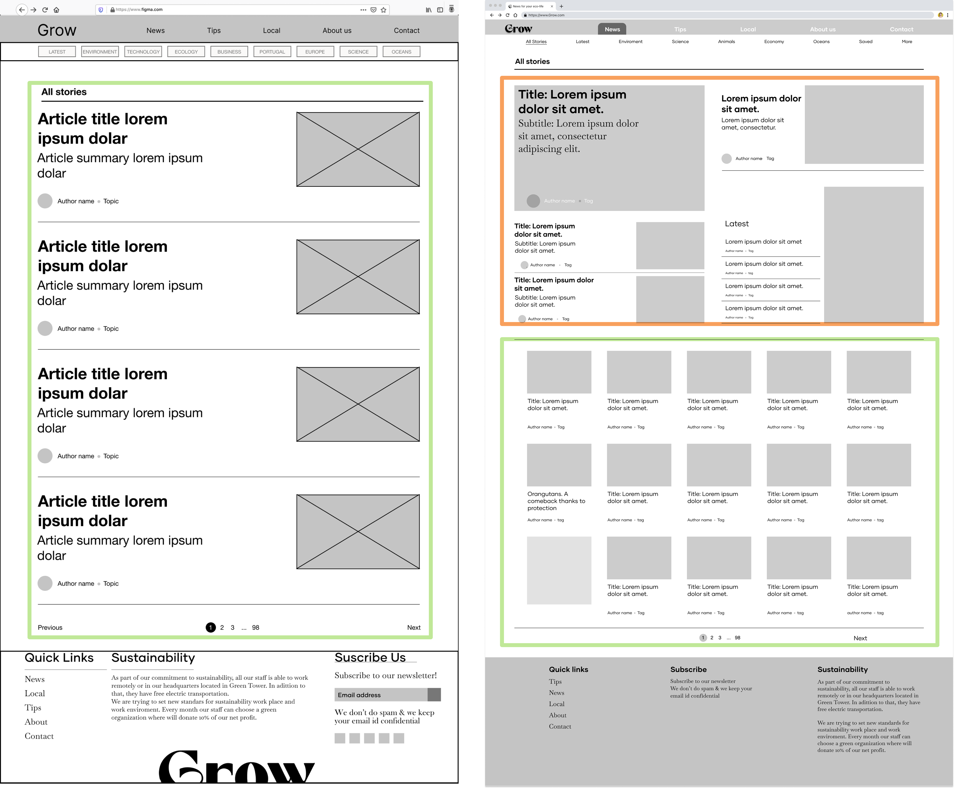
Change 1
The article's layout of the news section was taking up too much space making the user get frustrated and overwhelmed by the number of pages. There was also no space for featured articles or advertising.
Solution
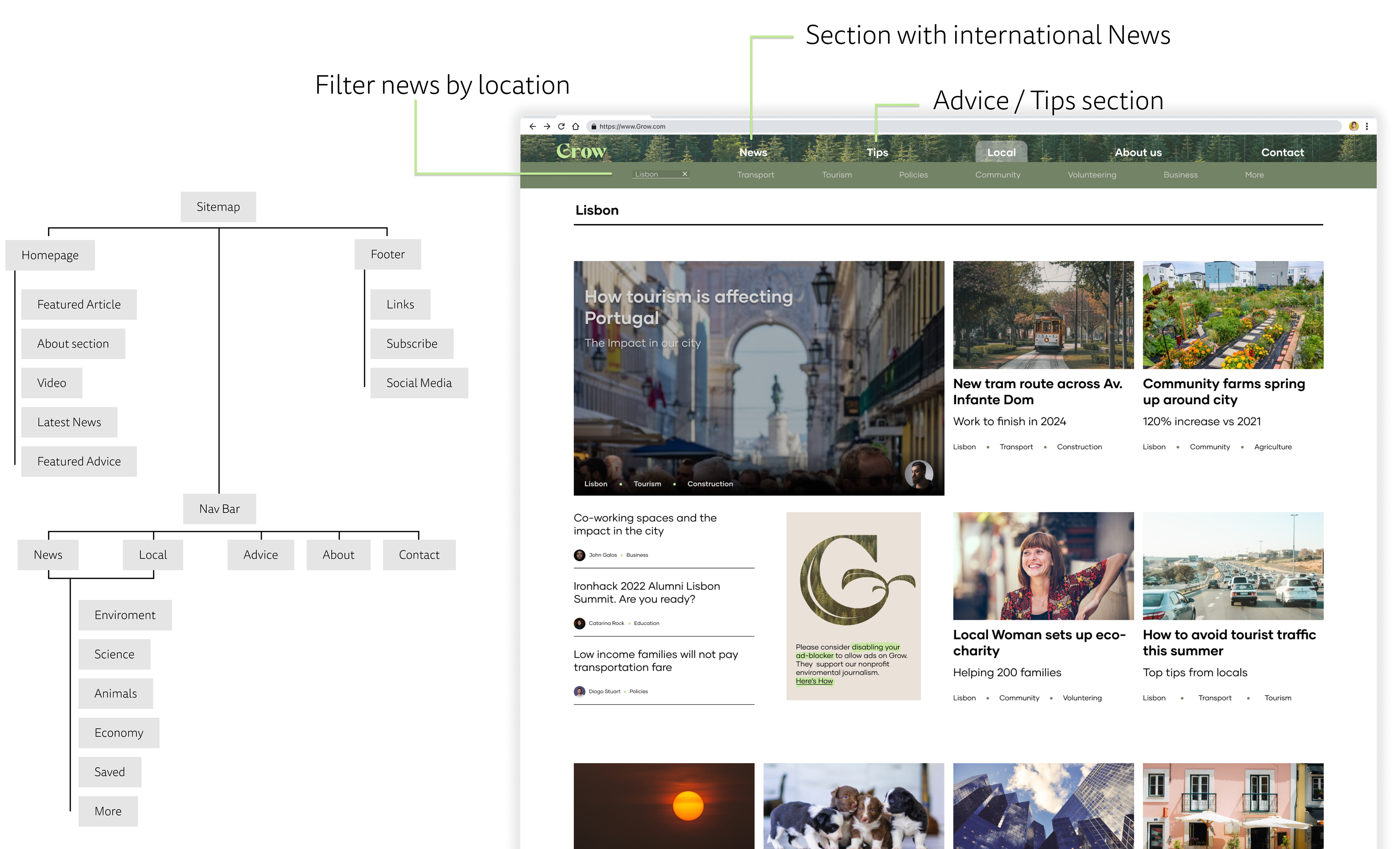
● The article cards were redesigned into a smaller footprint and grouped on a grid.
● The top section was dedicated to featured articles.
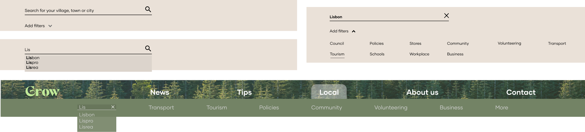
Change 2
The location search bar and filters were 2 independent lines.
Solution
They got combined and filters were changed into sections to allow the user easily navigate from one to another. If a section didn't have articles (Ex. Stores) the section was hidden from the bar.
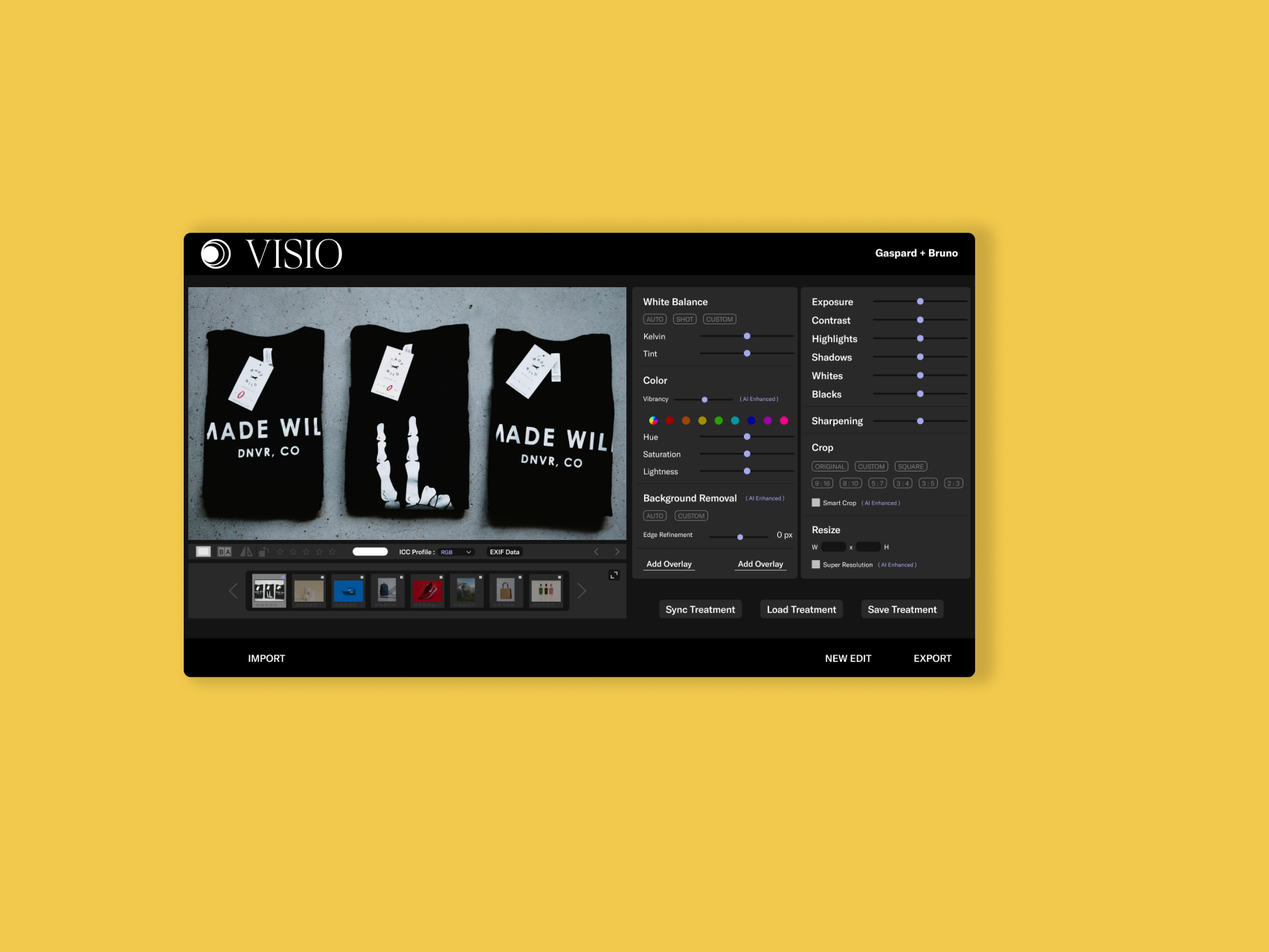
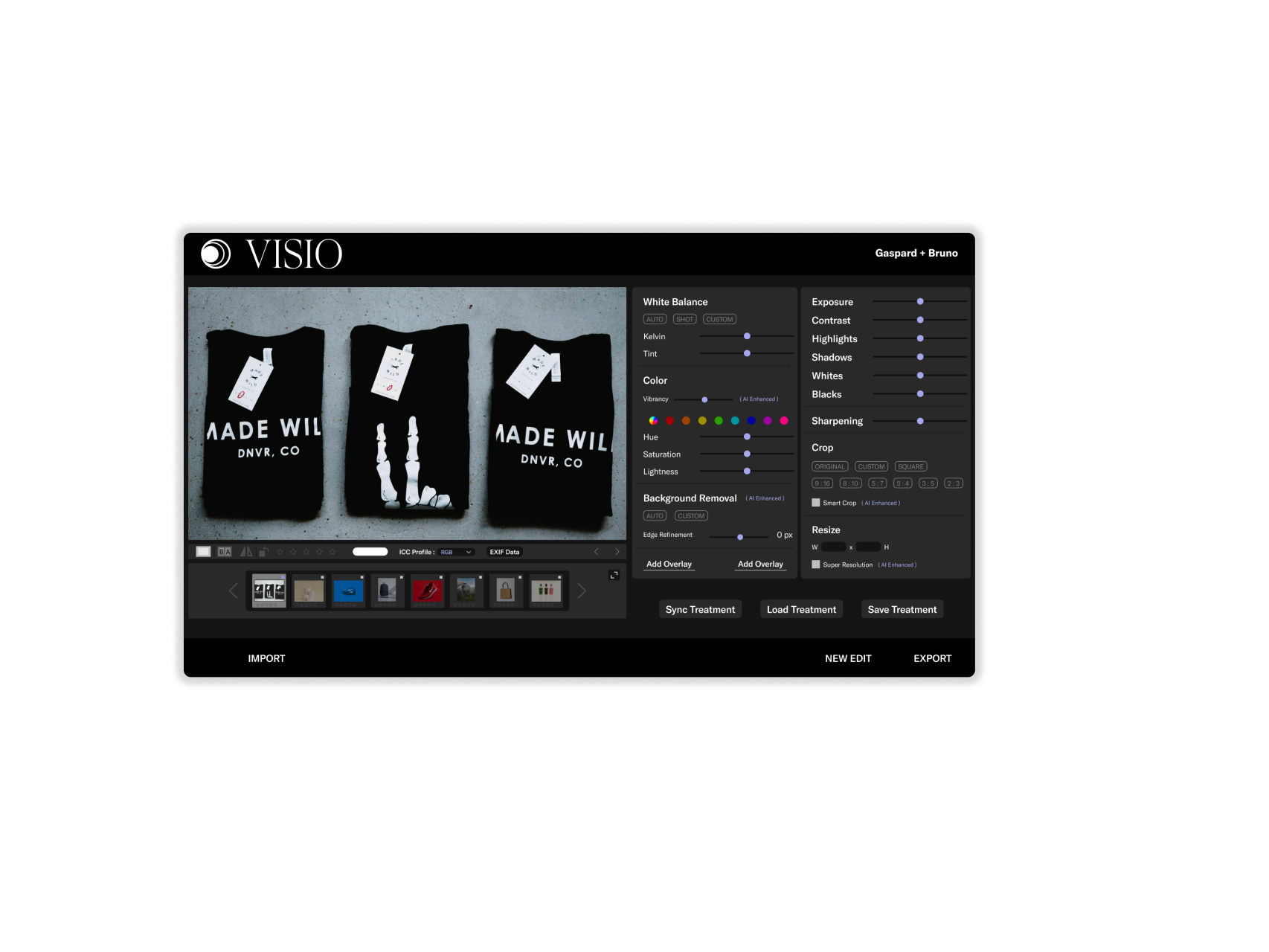
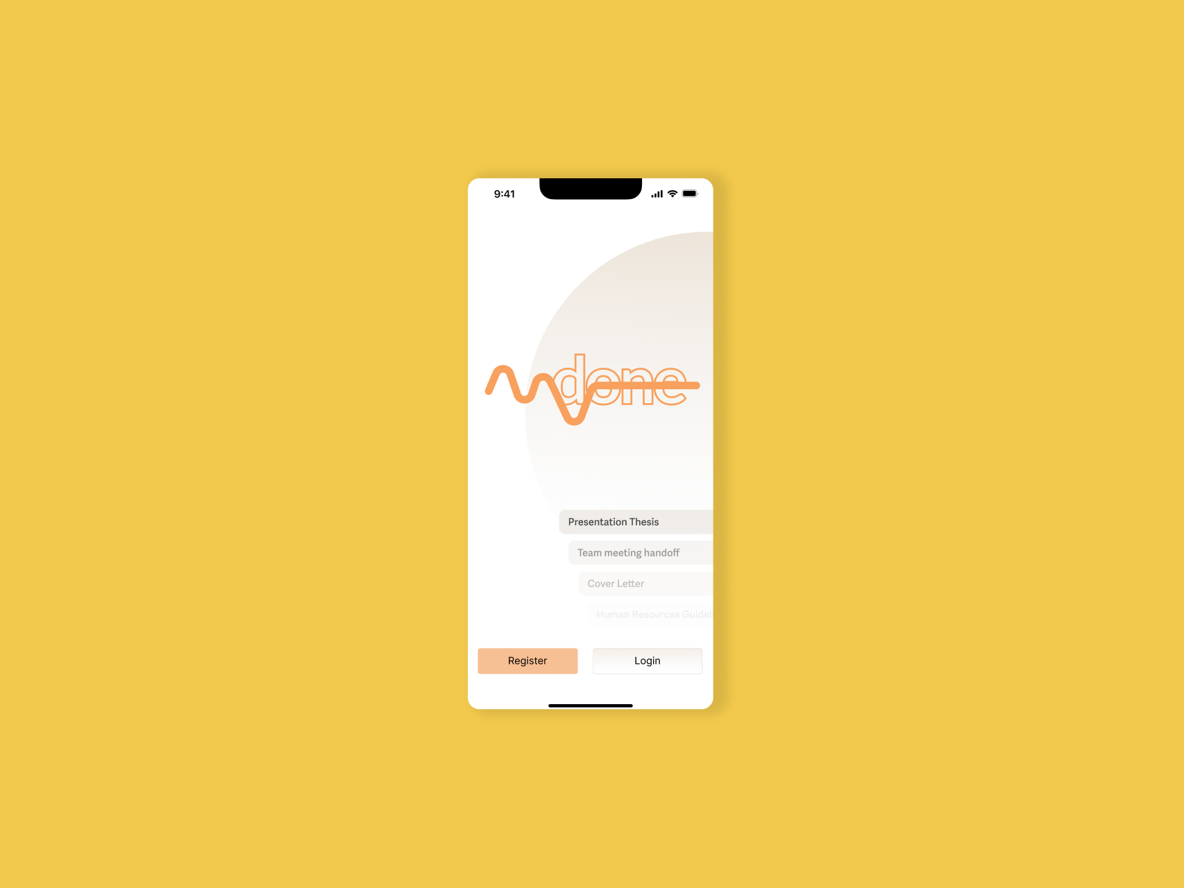
Mockups & Prototype —

Conclusion —
Learnings
Working in a team helped us not lose sight of the initial problems of our users and don't get lost in the design look. Because of the time constraint of the sprint, some parts of the webpage were missing (about page, author sections, advice sections).
Feedback
Receiving feedback and testing at every stage was very important and it helped improve the layout of each page as well as reorganize the filters section.
Design
The creation of the Style tile and Guidelines brought flexibility and consistency between each layout making it easy to keep the desktop and mobile versions cohesive through the different sections.
Next Steps
We believe that with more iterations and tests the layout can be simplified more to make the information easier to digest.
Mobile version
The layout of the local articles page and international news should be the same.
Author page
Create a section with information about each author and the articles that they wrote.