Overview
Visio Studio is one of the current Saas projects being developed for the independent creative agency Gaspard+Bruno.
A small agency based in London and Lisboa focused on developing web and mobile projects with the mentality of the user always first.
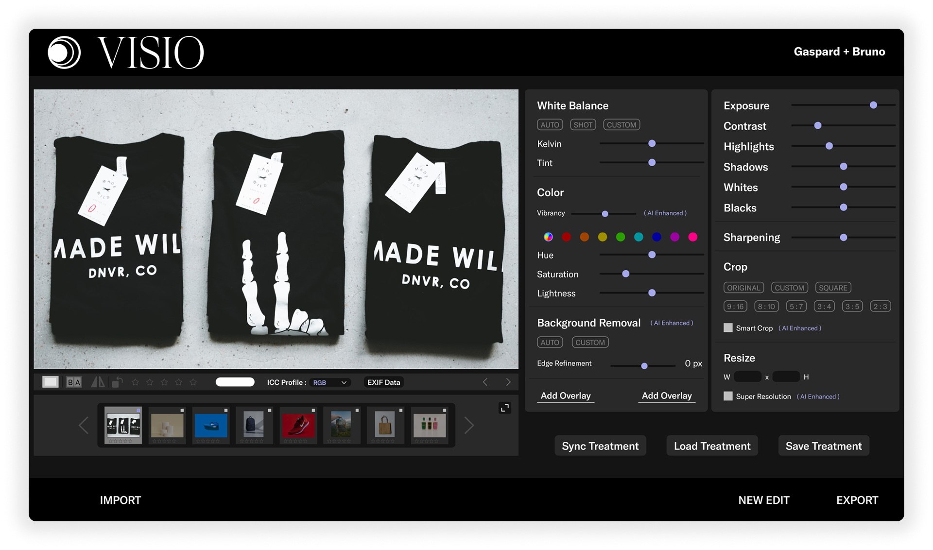
The software allows e-commerce photographs to streamline the editing process by automating and applying the treatments to hundred of photos with the help of Computer Vision.
The Challenge
While the project is currently being developed for desktop, their mobile version as well as their Figma plugin, where the user can remove the background automatically, is ready and published.
They are interested in seeing designs from external sources, and solutions to how the user will interact with the platform prioritizing:
They are interested in seeing designs from external sources, and solutions to how the user will interact with the platform prioritizing:
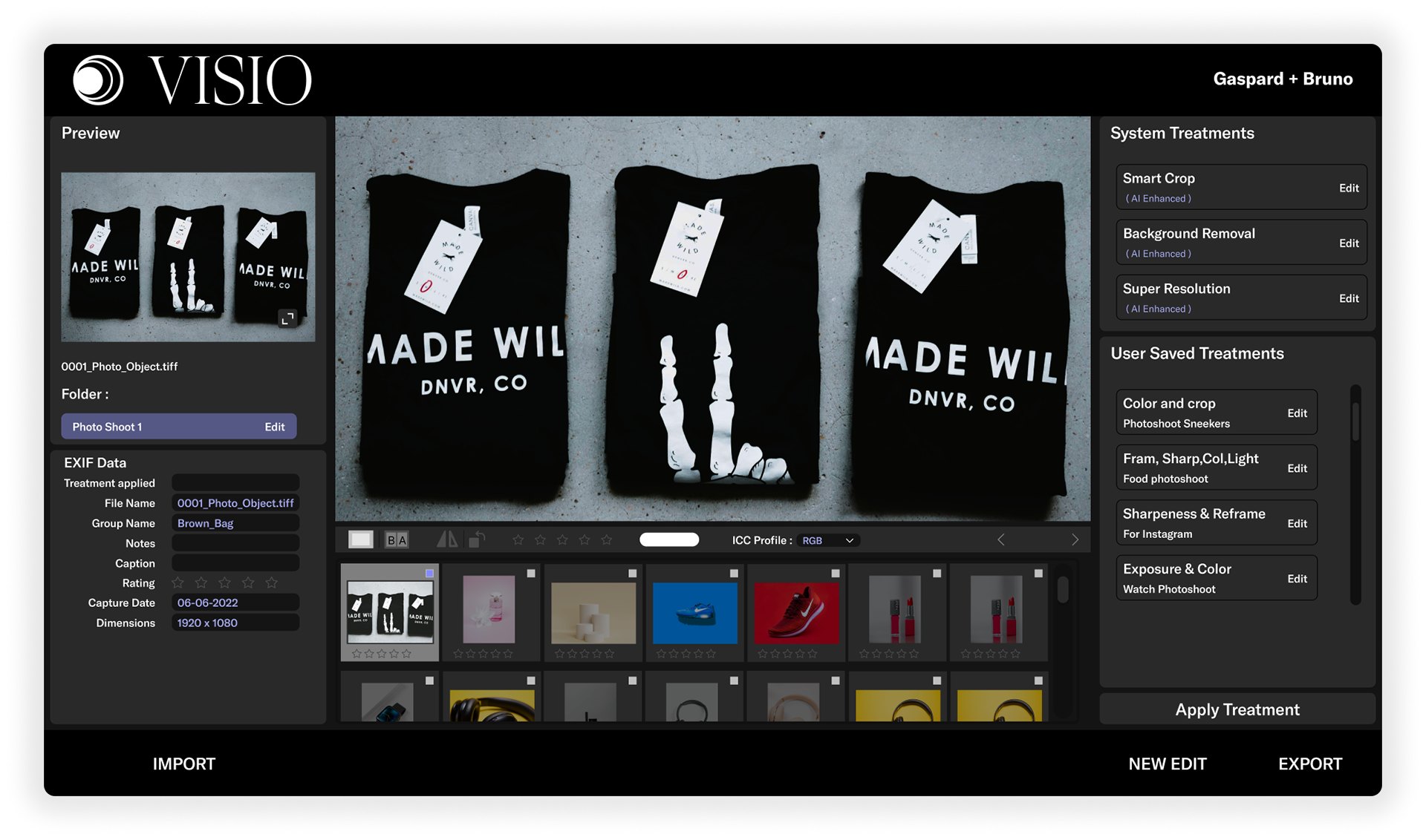
+ Creation and saving of treatments.
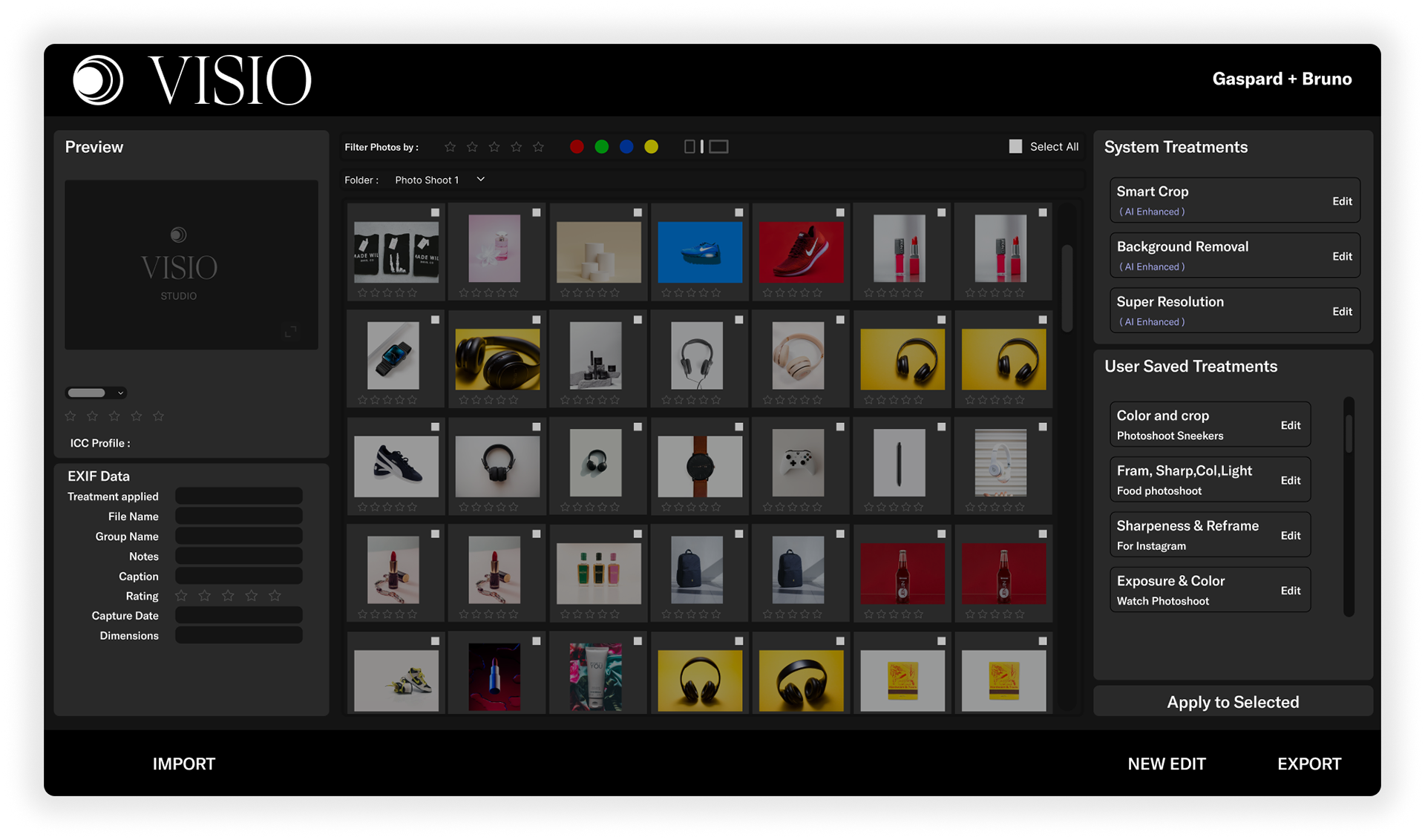
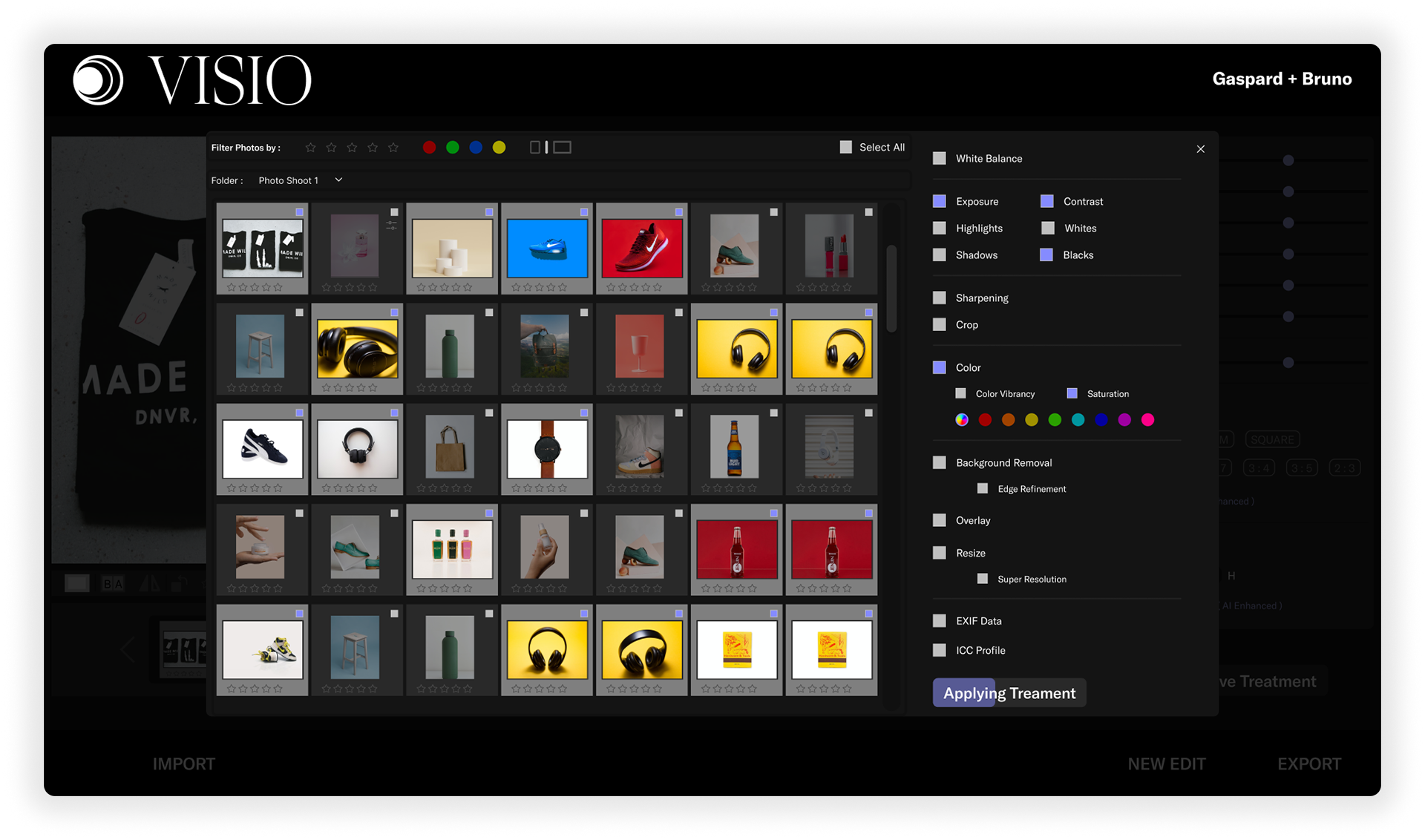
+ Reuse of saved treatments in several photographs at the same time.
Solution
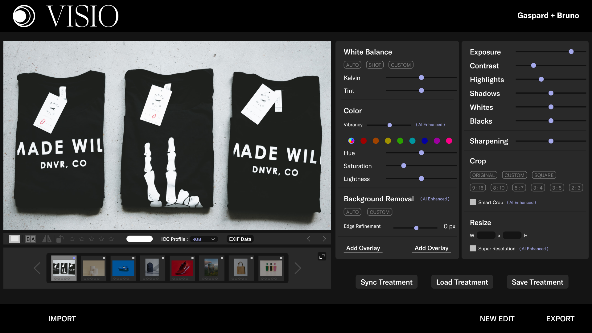
● A dark mode desktop design with the tools necessary to edit e-commerce photographs based on the feedback from users
● A user flow where a new treatment is created and saved.
● A user flow where a saved treatment is applied to multiple photographs.
● An interface where the information and tools are organized based on user feedback.
Research —
The Power of UX
Before my initial meeting with the stakeholders and the team at G+P. I started investigating what was Computer Vision Technology and how it was currently used with images.
My main goals for the research were to understand how product photographers and e-commerce agencies edit large amounts of photos quickly and what editing treatments they normally use.
My background in photography helped me tailor the questions as well as perform the competitor analysis on the major applications being used :
Photoshop | Lightroom | Capture One| Procreate | Facetune | Aperture | Luminar
Seeing users editing photos, and the insights from the business analysis, helped me create a list of tools and treatments.
With monitored card sorting tests, I was able to set the importance and order in which they should appear in the interface as well as to not include unnecessary tools that would overwhelm the user.
With monitored card sorting tests, I was able to set the importance and order in which they should appear in the interface as well as to not include unnecessary tools that would overwhelm the user.
Define —
To connect the dots between my target users, the insights I gathered from interviews & survey, the research, and the goal I wanted to achieve.
I created a User Persona, a User Story, and a User flow. This also helped me show G+P the structure of how I was answering the challenge proposed by them and the reasons behind my decisions on the design.
Branding —
The font families and brand colors were given by the client.
Since the research showed that users preferred to work with a dark mode interface, I created a set of shades from the brand color as well as from the black color.
A lighter shade of the brand color was used for the actions feedback and active state.
The choice of background color for the interface came from the competitors and market research.
— While editing, a white or black tint can modify the perception of colors for the user. —
As a result, I didn't use the brand color, instead, I chose Pure White and Black which the research established are used in photo editing software to measure colors for contrast and exposure of a photograph.
Testing & Iterations —
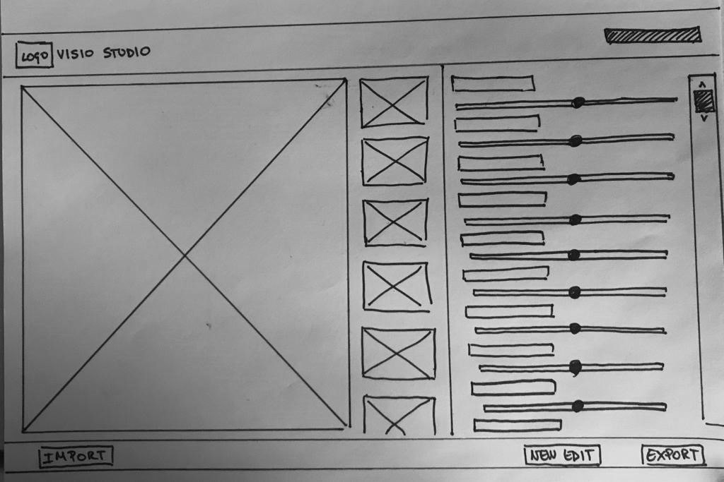
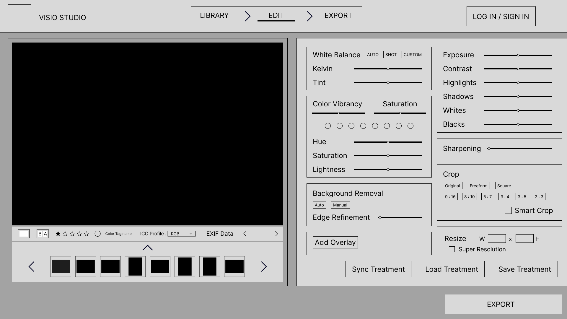
Through testing the low-fidelity I performed a series of iterations based on the user feedback that helped establish a baseline for the creation of the wireframes.
Some of the changes after the tests were:
◼ The layout changed from 2 columns to 3 columns.
◼ An expandable library was added to the editing view.
◼ A section for tags and information was added to the left side.
Changes on the Editing tab
The editing tools didn't have enough room and the user had difficulties interacting with them. Overall, the number of editing tools overwhelmed the user.
Solution
◼ Two columns
◼ Tools grouped by categories
◼ The name of the tool and interaction bar changed from a vertical disposition to a horizontal side-by-side disposition.
Mockups & Prototype —
Challenge 1
Creation and saving of treatments.
Challenge 2
Reuse of saved treatments in several photographs at the same time.
Conclusion —
Learnings
Designing a photo Saas was definitely a challenge and I had to balance functionality and aesthetics. To guide me through this process I rely completely on the user's feedback during the tests and I learned to be more methodical and not get lost in the design.
Interviews
Not having Photography agencies, that specialized in E-commerce, willing to answer some questions was tough to work around and pushed me to look out of the box and interview freelance photographers and small business owners instead.
Collaboration
See firsthand how a team of UX and developers work together was very enlighting and helped me keep a Figma file organized and pushed me to learn about Design Systems and Handoffs.
Next Steps
Overall, I would like to perform more iterations on the design to simplify the process and remove unnecessary information. In a second sprint, I would like to focus more on functionality.
Editing tools
Although the list is finished and all tests were satisfactory, a more minimalist design can help improve the experience
Library | Edit | Export
These 3 sections are not independent and I would like to test with users a design where all 3 are in the same windows.
Filters & Tags
I was not able to test this feature and I would like to iterate possible solutions to simplify it or even remove it.

